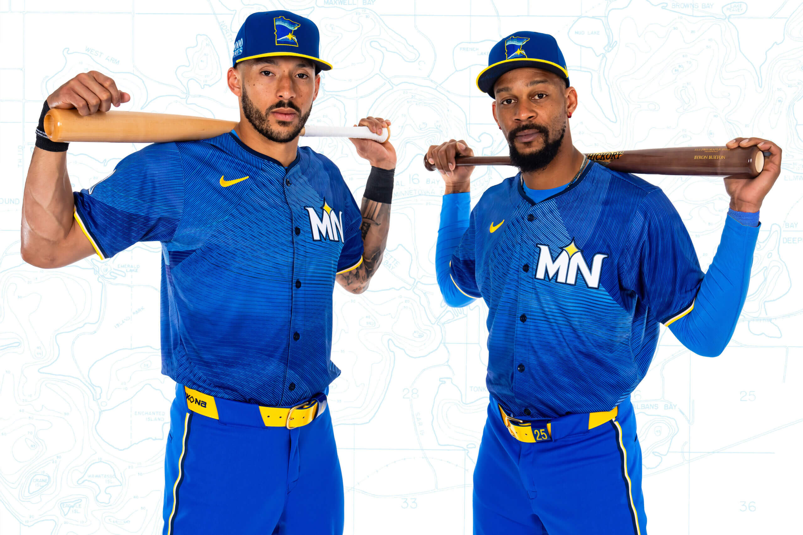
Red and white are out. Warm yellow and radiant pink are in.
As they unveiled their alternate Nike City Connect jerseys on Monday morning, the Minnesota Twins shed two of their original colors for new ones. Featuring several shades of blue mixed with yellow and a tinge of pink on the sleeves, the Twins presented their new digs, which they’ll debut Friday night against the Oakland A’s.
They call the theme “The Ripple Effect” and introduced it with a video created by two Minneapolis-born artists, DJ Skee and rapper Slug of the hip-hop group Atmosphere.
With an emphasis on the state over any one city, the Twins based their new project on Minnesota’s nickname, “Land of 10,000 Lakes,” and how water brings everyone together. The color scheme is said to represent the “golden hour” of a sunset lakeside.
“I just like being different,” Twins center fielder Byron Buxton said. “Let’s bring in a little bit of yellow. It’s different. I know it’s got a little bit of pinkish in it. That’s cool. Just to bring out different colors, for me, that’s something fun.”
The Ripple Effecthttps://t.co/bcodsrdnT5 pic.twitter.com/DkTugzDFeu
— Minnesota Twins (@Twins) June 10, 2024
The unveiling is the last step in a project that began in 2021. The Twins were the final team to participate in the first round of Major League Baseball’s City Connect jersey series that included 28 of 30 franchises. (Oakland and the New York Yankees elected not to.) The team chose to go last to create space between Monday’s unveiling and its November 2022 redesign.
Though some fans on social media disapproved of the new color scheme and said the look resembles jerseys previously unveiled by the Seattle Mariners and Milwaukee Brewers, among others, the idea of City Connect is to buck tradition with bold color schemes to attract new, young fans.
“The City Connect is more about the market and the city and the state and not necessarily about the Twins,” said Heather Hinkel, the Twins’ vice president of brand marketing. “It’s also an opportunity for us to remember to try to excite a new fan base. We know there’s going to be some people who love it and some people who hate it.”
The centerpiece is a blue baseball cap featuring a yellow bill with the state’s outline displayed instead of the traditional letter “M.” Though players were involved in the process, several said their input was minimal. However, pitcher Joe Ryan said he’d seen several alterations over the past two-plus years and likes the finished product.
“It’s cool they integrated the lakes and the vision is to bring the whole state together,” Ryan said. “Having been on the roster for a while, I’ve been able to see the early progression. They might look a little similar to other teams’ (uniforms), but to see that evolution is cool. The hats are really cool. I can see those doing well. I think they did a good job capturing Minnesota. I’m excited to put them on.”
One of the less visible but cooler elements of the hat is under the bill. In an homage to legendary local artist Prince, the Twins included a topographical map outline of Lake Minnetonka and its “purifying waters.” Though some fans hoped for the inclusion of Prince-based elements, the Twins opted to pay tribute to the artist, who died in 2016, by referencing a line from his 1984 movie “Purple Rain.”
“I like that part a lot,” Buxton said. “Just little bitty things like that that kind of make it cool.”
We don’t want you to feel like a fish out of water!
Repost now for a chance to win a #MNTwins City Connect hat! pic.twitter.com/dNMMuABEde
— Minnesota Twins (@Twins) June 10, 2024
Royce Lewis is a fan of the color scheme and the potential for accessories. A Nike client, Lewis was offered his choice from seven different cleats geared toward yellow and blue combinations. Buxton is excited about the socks he’ll pair with the jerseys while Ryan Jeffers is set to break out similarly colored catching gear.
Lewis was disappointed the Minnesota Timberwolves’ City Connect design also centered around lake life and confessed the Twins’ new digs look similar to those worn by the Philadelphia Phillies and Mariners. But overall, Lewis appreciates the color scheme.
“City Connect, to me, should be unique,” Lewis said. “I just remember seeing everyone else’s come out and being a little bit upset that they’re all the same colors. But they are sick. In terms of just looking at the (the Twins’) jerseys, not comparing them to anything else, they’re sick and I like different colors. … The yellow is going to be sick. (Ronald) Acuña (Jr.) wears yellow and it looks good. (Carlos) Santana wore yellow and hit a homer. I like yellow. Yellow is good.”
Royce Lewis likes the yellow in the new uniforms but said he wishes they weren’t similar to other designs. (MLB Advanced Media)
The Twins opted for a state-themed jersey after they chose to include Minneapolis and St. Paul in their popular creme “Twin Cities” jerseys in the 2022 redesign. With teams planning to create new City Connect jerseys every four years, the Twins wanted to keep their Twins Cities jerseys around for as long as they desire instead of having to rotate them out.
Since current and previous iterations of their jerseys include “Minnesota,” the Twins opted for a short, clean “MN” patch featuring a North Star on the left side of the front. The right sleeve features a patch with a loon, the state’s official bird. The North Star represents the bird’s beak and its eyes are the stitches from a baseball. Both the hat and jersey also include “10,000 Lakes” patches, while the jersey itself is comprised of blue ripples of varying darkness throughout.
“Some of the other City Connects look too similar to a jersey they might wear,” Ryan said. “It’s cool to get away from what our normal uniforms look like. They did a good job with that. It will be fun to see what works and doesn’t work with cleats and have a little bit of our own personal flair in there.”
(Top photo of Carlos Correa and Byron Buxton: MLB Advanced Media)