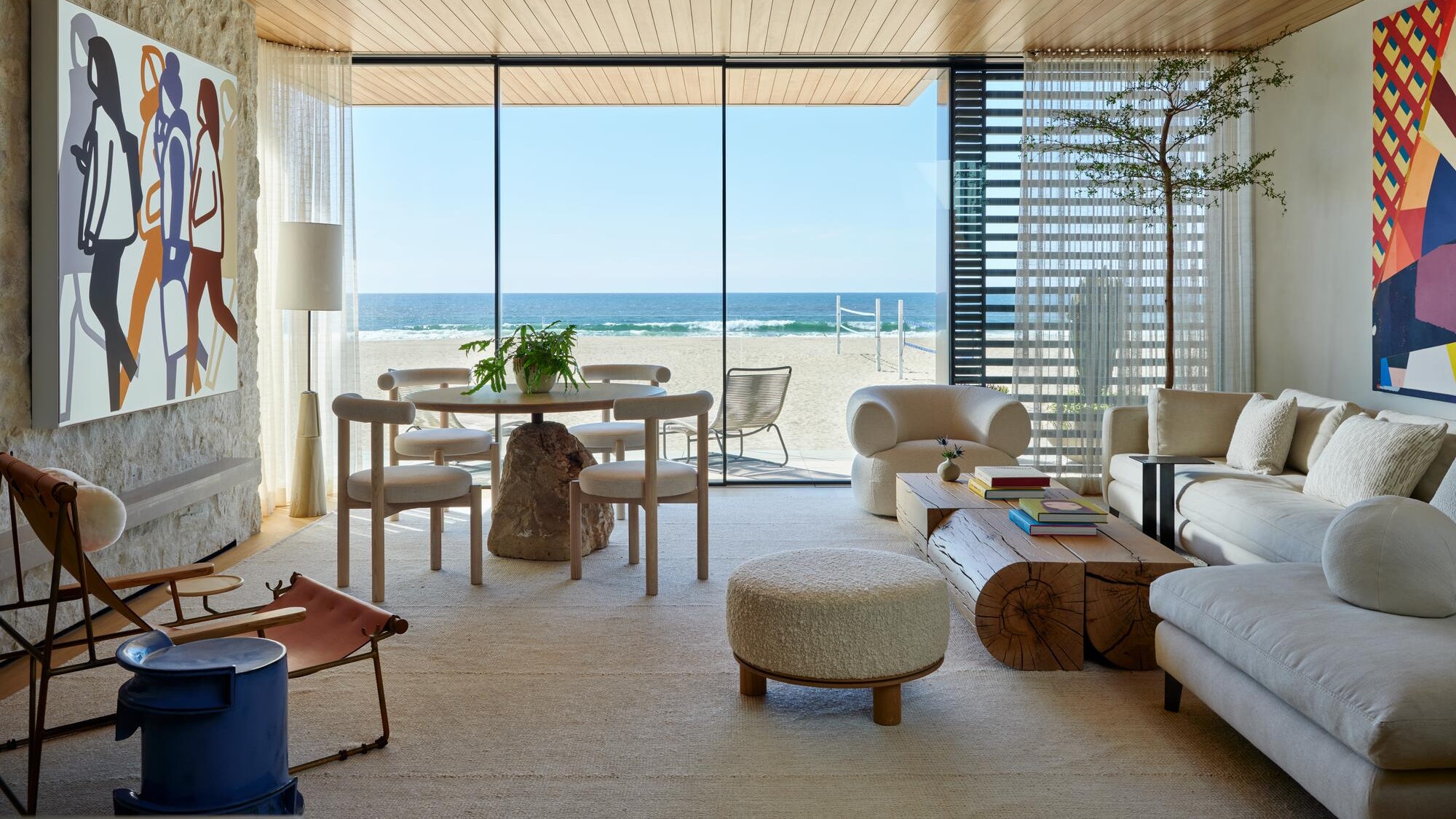
âAs you move up through the space, it continues to reveal itself,â says Woodward. âWith each level, it gets increasingly private. The ground floor is meant to be convivialâthere is this amazing outdoor, sunken conversation pit inspired by 1960s and â70s California modernism. Moving up, the second level is all about living and connectingâwith the kitchen and den, itâs where the stuff of life happens. On the third floor are the bedrooms and outdoor spa, which puts an emphasis on relaxation and restoration.â The beach views also change as one ascends. Laneyâs positioning of each level creates the sense that the higher one travels in the house, the more removed from the Strand they become.
To maximize ceiling heights on each level, Laney notes that they had to dig 30 inches below ground level and âuse some fairly advanced structural technology to make sure the floors were as thin as possible. The result is interiors scaled to accommodate large artworks from the clientâs collection, which served as jumping-off points for the material palettes and furniture groupings in each room. For the interiors, Woodward took a similar approach, choosing furniture and finishes that are subtle yet refined, in a neutral palette that doesnât distract from the view and showcases the art on the walls, including pieces by William LaChance, Robert Longo, Robert Rauschenberg, and Mickalene Thomas.
âWe wanted to create an interiors project that wasnât just sitting on top of the architecture, but really woven throughout,â he says. Starting with a base of sandy-toned plaster walls, European oak flooring and ceilings, and hemlock millworkâthe woodâs warm tones prevent the project from sliding into stereotypical âbeach houseâ territoryâthe design team created an elegant abode that doesnât take itself too seriously. Itâs a place where people can come in from a day in the water and plop down on the couch without fear of damaging anything. âMy aesthetic is comfort, comfort, comfort,â says the client, âbut it still has to be beautiful.â
It turns out that while the client prefers big art, she doesnât mind scaled-down roomsâespecially when there is a stunning view involved. âThe primary bedroom is small in the most amazing way,â she says. âI feel like Iâm in a shipâI wake up in the morning and donât see anything else but the oceans and the dolphins.â

