Triadic colors is a color harmony involving three colors that are equidistant from one another on the color wheel, creating an equilateral triangle. Because of their distance from each other on the wheel, each color does not share any common color hues, and the result is often a balanced but vivid contrast. One of the most common triadic color harmonies are the primary colors (red, yellow, and blue), but secondary colors (orange, green, and purple) are less easily noticeable but still common combinations.
Tetradic colors, also known as double complementary colors, are color combinations that use two pairs of complementary colors for a total of four (“tetra,” in Greek) colors. When looking at the color wheel, the four could create a square or a rectangle, depending on whether the four colors are equally distanced on the color wheel or not. An example of a tetradic scheme where the colors are equally spaced apart would be red, green, yellow-orange, and blue-purple. Because of the two sets of complementary colors, tetradic schemes are typically powerful, dynamic, and dramatic, especially when they use pure hues rather than tints or tones.
Warm and Cool Colors
Generally speaking, primary colors are seen as most vibrant and eye-catching, and colors become less vivid and more subdued with each mixing. But regardless of vibrancy, most colors are either warm-toned, cool-toned, or neutral.
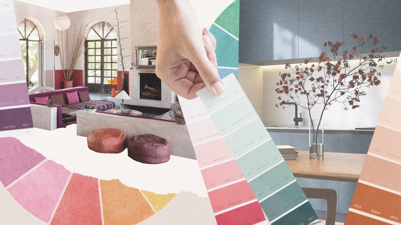
Hues that have a strong red or yellow base tend to be considered warm colors, such as yellows, browns, tans, pinks; warm colors are often associated with daylight, sunset, and more broadly fire and heat. Designer and AD PRO Directory member Sarah Jeffreys, of Sarah Jefferys Architecture + Interiors, explains that she finds these warm colors to be “cheerful, bright, playful, and happy hues that can evoke a sense of cheery sociability and optimism. I use these bright warm hues anywhere I can, but I am especially known to love a splash of color in the kitchen with the lighting or backsplash to bring vitality to the heart of the home.”
Cool colors, on the other hand, typically have a blue base and can range from greens to blues to purples, and are often associated with feelings of serenity and calmness—perhaps because of the connection to water or the sky. As interior designer and principal at Laure Nell Interiors, an AD PRO Directory firm, Laetitia Laurent suggests, “Cooler hues like deep emerald greens or misty slate blues can make a room feel both expansive and serene, perfect for creating a sense of calm in a bedroom or study.” But regardless of whether you use warm or cool colors—or both mixed together—she emphasizes that “it’s about using color intentionally to influence both how a space looks and how it feels.”
Who Uses A Color Wheel?
Color wheels help just about anyone doing anything visual. Artists, designers, craftspeople, marketers, and many others use color wheels and color theory to help to decide what colors go together, and what statement they want to make. For interior designers, decorators, and architects, color wheels and color theory are fundamentally important to their work because it helps evoke emotions, create visual harmony, and reinforce brand identity, while also guiding focus and improving legibility.

